Monday, 17 September 2012

Key Audience Terms (Add more detail)


Qualitative data is describing meaning, rather than with drawing statistical inferences. What qualitative methods (e.g. case studies and interviews) lose on reliability they gain in terms of validity.  They provide a more in depth and rich description.

Quantitative Data is data measured or identified on a numerical scale.

Psycho graphic Data is data that links objective demographic charactoeristics, for instance, age and gender with more abstract characteristics. 

Demographic Data are the uncharacteristic's of a human population as used in government, marketing or opinion research.

2012 - 2013 A2 Media Studies Blogs


Wednesday, 12 September 2012

A2 Media Studies, Skill Development, Evaluation Essay

At the beginning of the year I first completed a task which was to produce a college magazine. This was to prepare us for the next big step which was to produce a music magazine cover, contents page and double page spread. Creating the college magazine was quite difficult as it was my first time using Adobe Photoshop CS5 and a high tech camera. For the college magazine I had to take numerous images and then choose a final image for the front cover. The image of the model had to be a medium close up. The image then had to be edited in Photoshop, this was to make it look refined, clean and sharp. The image was then put onto a plain background and text was added to it to make it look like a real life college magazine. For our actual coursework piece, I had to create a music magazine which consisted of a front cover, contents page and a double page spread. I also had to pick a genre for the magazine, I chose indie rock. Just like the college magazine, I used a high tech camera, to take numerous photographs. I had to choose one main image for the cover, a couple for the contents page and one for the double page spread. In total I used two models, Luke Bolton who was the main image and story and Tom Brown who was the other model, I also used a photograph of myself for the contents page, and this was used for the ‘A WORD FROM THE NEW EDITOR’ section. The preparation for the magazine was very helpful. I researched lots of different magazines, including NME and VIBE, these are two of the most popular music magazines. I did this so that I could get ideas on how a music magazine looks and catches the audiences/readers eye when it’s on the magazine shelf in shops. I also looked at music magazines which were the same genres as what my magazine was going to be (Indie Rock). A number of actual conventions were used for my music magazine such as images, dates, barcode, mast head, skyline, splash graphic and a website link. All of these conventions are used in real media texts.  I also looked up prices of real music magazines and produced a questionnaire. On this questionnaire it asked students what price they would pay for an Indie Rock music magazine. I did this so that I could tally it up and find the average price of what people would be prepared to pay. In result to this I found that people would be prepared to pay a maximum of £2.50. I then used this as the price for my music magazine. All of these conventions are used in real media texts.

Before I started AS Media Studies, I had reasonably good PC and editing skills. However, I didn’t know how to use Adobe Photoshop CS5. At the beginning of the AS year we were given a tutorial from a media technician. He showed us how to use each tool in Photoshop. We were shown how different tools we used and what they were used for. He showed us how to rotate images, make skin appear flawless like in real media texts, he also showed us how to change eye colour, hair colour, brighten the white parts of the eyes, changing the colour of text, how to move text and images and background colour.  This tutorial prepared me for when it came to using Photoshop.

This prepared Photoshop skill tutorial was then used to produce my music magazine. Using my previous taught knowledge on how to use Photoshop the first thing I did was imported my image onto a blank spread page. This was so that I could edit it properly. I used the lasso tool to cut out my model from the background of the photo. This took some time as I had to take extra care making sure that it was a neat and a clean cut. I then used the smudge tool to smooth out the edges. This was so that it looked like a professional photograph to go onto a real life media text. For the main front cover image, I changed the skins appearance so that it looked flawless. I did this by selecting parts of the skin and slightly blurring it, this made it look airbrushed. I also added text onto my front cover and changed the colour of it, this was so that it matched my black, red and white colour scheme.  I added shapes to my front cover. A circle was used to give the effect of a splash graphic, and I also used a thin rectangle, which was placed at the very top of my cover to give the impression of a skyline. The masthead was created on an online text creator. To make my text look bold I created a box to go around the outside of each sub story. This was to make them stand out to the reader. For the contents page I used the same colour scheme to carry on the pattern, this made it looked professional and not messy as it appeared neat and tidy. On the contents page I flipped the top image and used it as another image below it because I thought it looked interesting and imaginative. I also carried on this colour scheme with the double page spread. I found writing the article relatively easy as I enjoy making up stories, this benefited me when coming to do this part of the task. In the  article on the double page spread I used my creativity skills and began the sentences with the initials of the band, this was ‘HARLAND WAY’. I believe this gave me and interesting advantage of the audience’s outlook on my finished text, as it looked cool and interesting.

As the time went on whilst making my music magazine, I became so much more familiar with Photoshop and I also became more confident with what my end text would look like. At the beginning of the year my magazine was looking quite run down and uninteresting, but as I started feeling more confident and putting more effort and time into producing the magazine, it started to look a lot more intriguing. This gave me that little push to know that it would all be worth the effort.

Over the past year a lot of time and effort has been put into producing my AS Foundation Portfolio work. I am very happy with my finished product as it shows all my hard work. If I were to go back in time, the only thing I would change about it would be the position of text on the cover as I feel that it crowds around the models face too much, this may cause readers to lose focus on the main image. Therefore in my next piece of text I will carefully plan it out properly making sure of every little detail before I start to produce anything.

Brief - (Needs changing to Film Trailer brief)


My Brief:
1) A promotion package for the release of a film, together with two of the following options:
- A website home page for the artist
- A cover for its release as part of a digipack (CD/DVD package)
- A magazine advert for the digipack (CD/DVD package)


Create a YouTube Channel


I have created a YouTube channel so that what I produce videos of my own work I can add them on to my channel for everyone to see. This is easier than having to show each person individually.  YouTube channels are used by thousands of people to show videos to the world. You can watch pretty much anything on YouTube. For instance, film trailers and music videos as well as clips from programmes. 

Below as some images of my YouTube channel:


Codes & Conventions of Selected Brief (Genre, Narrative, Media Language, Representation& Audience Theory Test)

Codes and conventions of a film trailer – essay

Codes and conventions are a way of constructing meaning in media texts. There are two main reasons that codes and conventions are used for, these are, that it allows the audience to become familiar with a certain genre and that it ensures that a certain text works well and fits into its genre.  The conventions of a music video vary depending on genre of music. However, some general conventions are, the artist is shown performing, the lyrics of the song influence what is shown in the video, the pace of editing fits the pace of the music, and the codes of dress reflect the mood of the song.

The purposes of a trailer are to promote and introduce a film. They normally introduce the story line, genre, setting and characters which should lead to the audience having certain expectations about the film. Genre and story line are the two things that give the audience the most expectations. A genre carries certain conventions; for example, with a slasher movie you would expect a killer, murderer’s weapon, screaming victims, police investigating etc. This means the audience would want to see some of these things within the trailer so they can identify the genre. The clips used are non-chronological but they have a structure that outlines the film’s plot. The majority of trailers have a voice over in them so we would need to strongly consider incorporating one into our piece of film. They can tell the audience about characters, plot and setting for the film. This can be over the film or it can read out text that is displayed in the trailer.

Mise-en-scene is usually dark and mysterious, the protagonists mainly wear typical clothing so that they are relatable to the audience who is watching. Ominous settings are often used such as abandoned towns/houses, the woods and open spaces. The lighting is most of the time low key, especially in scary scenes and during the night. Weaponry is also used such as knives, bats and even sometimes spades and guns.

This is a shot of the girls bedroom in the film trailer for the film The Possession, as we know mise-en-scene is everything in a shot. We can see here everything in the girls bedroom, for instance, props and costume.


The camera editing within horror/thriller uses fast editing during to shock the audience, they also use slow, long cuts when tension is being built. Panning shots are usually used to reveal threat and close up are used to show the characters expressions such a innocent and also screams of horror. Long shots are used to emphasis vulnerability of protagonists.

This image is a closeup of a girls face in the film trailer for The Apparition, it shows her expression and we can see a look of fear on her face.

This is an establishing shot which is at the very beginning of the film trailer for The Possession, it shows the location of where the film is based when been filmed and where the events are going to take place.


Sound is very important when producing a horror/thriller film and trailer. Silence is often used to build tension. Loud and sudden beats are used to shock audience and diagetic sound is used, this includes screaming, cries of pain and also demon/monster noises. As we know, trailers have a limited time to build tension and fright viewers, the music usually builds up very quickly. 

Deconstruction & Reconstruction of Media Text - Reshoot & Edit 30 seconds of a Media Text (Group Task)

Monday 8th October 4:00pm

Allocated Roles for Media Group
1) India - Photography/Background dancer
2) Jen - Camera/Editing
3) Philippa - Director
4) Toni - Camera/Music
5) Nadia - Background dancer
6) Han - Florence/Main performer
7) Jasmine - Background dancer
8) Mark - Editing, Photography

Song Chosen : Rabbit Heart (Raise It Up) - Florence & The Machine
Rabbit Heart (Raise It Up) - Florence & The Machine.

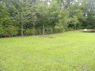
The first location that we thought we could use, was the back of the college field. Although we had a few problems with this location as you could see the houses of the surrounding area.


The second location that we came across was the pond and grass area near the Wilson building. We chose this area as it had enough performance space for us to use and it also looked like a good area for our video, it is similar to the location used in the Florence and the machine music video.


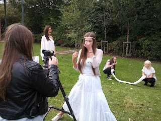
Here are some images to show our roles within the making of the short music video. As you can see each of us took a turn in filming and also performing in the video. 


Production Plan for Florence Video (More detail)

27.09.12 - planning schedule. Toni getting song. Jen shawl. Me necklace.

28.09.12 - filming in lesson. Jen and Toni editing period 5.

01.10.12 - lesson 4 after lunch filming. During media lesson half of us film other half edit.
02.10.12 - Just Toni edit after lunch.

03.10.12 - Wednesday after lunch we'll all meet to do something to be decided closer to the time when we know how things are  moving along. (ALL FILMING MUST BE FINISHED BY THIS DATE)

04.10.12 - Jen + Toni free together 3rd period.

05.10.12 - lesson 5th period.

08.10.12 - deadline at 4:00pm adding final adjustments in the lesson.


Costumes
White floaty dresses for girls
Lace
Shirt
Headband
Makeup

Cast
Han - Florence
India, Nadia, Jasmine, Philippa - Background dancers

Location
After searching around the college for locations to use, we came across the pond near the Wilson building.

-Story Board briefs (video briefs) Scripts & Synopsis (Trailer or short film) Site Navigation Plan (Website brief)